On the Drawing Board
All these jobs from last month are seeing print, so here’s another I can now share. This one was an odd job as it started out way back in June, then got shelved, changed subject matter and finally went to final.
The client was Contingencies Magazine, a publication for the insurance and financial industry. The original concept back in the early summer was to do a cover showing primary candidates from both parties fighting over health care issues. The client wanted a few concept sketches, so I did the obligatory “race” concept and one where the candidates were doctors surrounding a patient and trying to push their particular “prescription” for health care on him. Here were the roughs:


They liked the exam room concept, so I fleshed out the idea more, including some rough caricatures of the various front runner candidates at the time.

At this point the idea got shelved because they felt it was too early to do a story about primary candidates as they would probably change as the actual primaries neared. As it happens they were dead right. Last month I got the call to continue the concept, but now we needed to replace those candidates that were out (Tommy Thompson, Al Gore, Newt Gingrich and John Kerry) with ones that were in (Joe Biden, Fred Thomspn, Sam Brownback, Christopher Dodd).

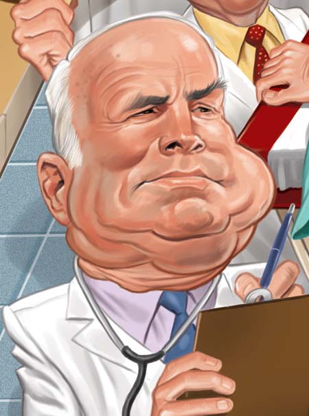
You’ll notice I also redid the caricatures of Mitt Romney and Barack Obama… the originals were rough and not very successful. This was approved and I went to final. I had done another cover for this magazine a few years back, so I went with the same technique for color as I did on that previous job… sort of a combination fully painted and line art. Here’s the final and some close ups of a few areas:


Comments
Tom's Newsletter!
Sign up for Tom's FREE newsletter:
Categories
- Classic Rock Sketch Series (60)
- Daily Coronacature (146)
- Freelancing (173)
- General (1,658)
- Illustration Throwback Thursday (107)
- It's All Geek to Me! (53)
- Just Because… (1)
- MAD Magazine (918)
- Mailbag (691)
- Monday MADness (454)
- News (1,044)
- On the Drawing Board (160)
- Presidential Caricatures (47)
- Sketch O'The Week (848)
- Stuff from my Studio (21)
- Surf's Up Dept. (29)
- Tales from the Theme Park (17)
- Tom's MADness! (149)
- Tutorials (18)
- Wall of Shame (17)


Wonderful work Tom!
Great stuff Tom! Likenesses were spot on.
Its fun to see how the patient character in the middle evolved from being a bald guy,to a guy wth a moustache to the final look he evolved in to in the finale.
Tom when you do a political orientated piece,do people or clients ever remark/question about where you place certain candidates in the project thinking you may favor a certain candidate even though you are not?
Again the drawing was awesome.Likenesses,detail on the office,especially the floor tile!
Seeing those slips of paper up close, and the way they were shaped, I halfway expected to see “10/6” written on one as a reference to the Mad Hatter from Alice In Wonderland. Just a random thought those papers inspired.
Nice work, Tom. You keep the integrity of your style and approach with a more painted, polished look. I dig it… except for the absence of Ron Paul!
Amazing work, Tom. Just beautiful.
Thanks, everybody. Glad you liked it.
Oh, that’s excellent! And you did that for Bono Mitchell’s design firm. She’s an old friend and she was bragging about how well this came out. Nice job, and those are some difficult-to-draw faces in there.